-
Posts
190 -
Joined
-
Last visited
-
Days Won
17
black.dragon74 last won the day on December 26 2020
black.dragon74 had the most liked content!
Contact Methods
-
Website URL
https://lifeisfantas.tk
- GitHub
Profile Information
-
Gender
Male
-
Location
India
-
Interests
Programming, Writing, Gaming.
black.dragon74's Achievements

Sergeant First Class (8/17)
63
Reputation
-
fx1096015776 started following black.dragon74
-
dinurajar started following black.dragon74
-
Hey everyone, This is going to be a small post detailing how to fix jack sense issue while we use AppleHDA for on-board audio. This also fixes crackling noise that we get when plugging/re-plugging a headset. Note: This method won't work for anyone using VoodooHDA to enable on-board audio. The fix is very simple. Download latest ALCPlugFix from: https://github.com/black-dragon74/ALCPlugFix/releases Make sure you have CodecCommander installed. If not, download and install it from: https://bitbucket.org/RehabMan/os-x-eapd-codec-commander/downloads/ Unzip the downloaded file. Open terminal and cd to the downloaded directory. Then run install.sh file. I have tested it working fine on ALC 255, ALC 3236 and ALC 295. Please reply with your ALC version if it works for you. Regards
-
black.dragon74 changed their profile photo
-

How to implement custom fan control on ASUS laptops
black.dragon74 replied to black.dragon74's topic in FAQs & Tutorials
To everyone, the SSDT-FAN in post #1 was only tested uptown Skylake. I recently got a new Coffeelake machine. Once I get some free time, I will update this SSDT to work with newer systems. Note: FAN CONTROL ON ASUS GAMING LAPTOPS IS COMPLETELY DIFFERENT. THE SSDT IS MEANT FOR NORMAL HOME/OFFICE LAPTOPS WITH 1 FAN ONLY! Regards -
jazib imtiaz started following black.dragon74
-
can you please help me fixing wifi issue on my 3468
i am using AR9565
-
ZainAnjum started following black.dragon74
-
Raghav Pahuja started following black.dragon74
-

How to implement custom fan control on ASUS laptops
black.dragon74 replied to black.dragon74's topic in FAQs & Tutorials
Attach proper problem reporting files. See How to generate proper problem reporting files. -
Mohammadtaghi Farkhondekar started following black.dragon74
-
black.dragon74 started following Dell 5548 High Sierra Issues during Installation
-

Dell 5548 High Sierra Issues during Installation
black.dragon74 replied to johnson23493's topic in The Archive
Yes. Using a SSD will result in dramatic performance increase. -

Dell 5548 High Sierra Issues during Installation
black.dragon74 replied to johnson23493's topic in The Archive
APFS on a HDD is painfully slow and is not recommended under any circumstances. Install to HFS+J. -
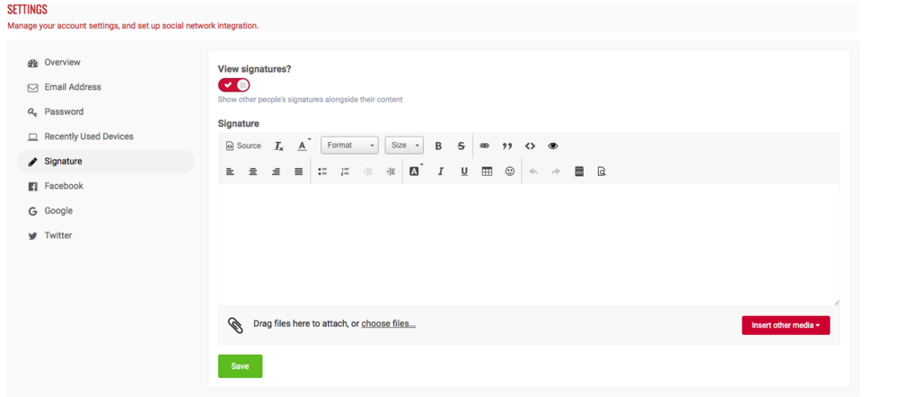
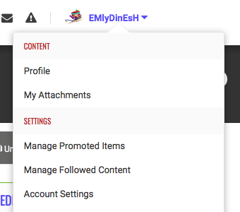
Hey community! As you all might know we underwent a massive upgrade from our old forum to this new one. After the upgrade you might have noticed that signatures aren't that well visible. They look completely out of the place and are a total mess to look at. So, after tuning up our site and handling the core things, I have managed to take out some time today and was toying around with the web developer tools in Chrome. I wanted my signature to look a bit different and more stylish. As you can see, it also has some fancy animation once you hover over it. You can look at the source code for my signature by inspecting the element. Here's how you can apply custom CSS3 styling to your signature: Navigate to "Account Settings" from the user settings drop down menu (top right). Select "Signature" section. Now you need to change to source code mode as default IPS WYSIWYG is a headache when it comes to styling. Plus the CK Editor we get in Signature's section is very slimmed down (features removed). To change to source mode you need to click on the source button on the editor's toolbar. Here's a visual reference: Once you switch to the source code mode, the first thing you wanna do is put your signature in the center of the screen. You can also use css but using a <center> tag of HTML would be more handy. Now, by default IPS uses span element to store your signature and span is not that friendly when it comes to animating it. The first thing you wanna do is use a div tag to store your signature and give it a custom unique ID. Like, <div id="myUniqueID"> This is a sample signature </div> Here the id of our div element is myUniqueID. We will be using this ID in our CSS to style this element. Now, here's the problem, once you use a div tag, your signature will take up the whole place overlapping with some controls in the signature are. Hence, it is a must to use a max-width property to circumvent this issue. So, here's the basic bare bones syntax of a typical custom signature: <center> <style type="text/css"> /** Styling for our custom div element goes here **/ </style> <!-- Declare a div tag with custom ID --> <div id="myUniqueID"> This is a sample signature </div> </center> Now, I'm gonna provide an other copy and paste code that shows how to control your signature's element using CSS (for noobs) <!-- Source code for Nick's signature on OSXL --> <center> <style type="text/css"> /* Styling for the root DIV tag */ #myUniqueID{ /** This will control your signature's text appearance **/ } /* Optional if you wanna do something when cursor is hovered (try hovering my signature) */ #myUniqueID:hover{ /* Code goes here */ } </style> <!-- Now we are just going to create a div element with our custom tag --> <div id="myUniqueID"> Please be kind to others. Help us to help you. </div> </center> That's all that you need to know. Here's an advanced example of how to use custom code for signature. This is the current source code for my signature. If you have any doubts you are free to ask me about it. <center> <style type="text/css"> /** Custom animation to shake an HTML element using CSS **/ @keyframes shakeSign { 0% { transform: translate(1px, 1px) rotate(0deg); } 10% { transform: translate(-1px, -2px) rotate(-1deg); } 20% { transform: translate(-3px, 0px) rotate(1deg); } 30% { transform: translate(3px, 2px) rotate(0deg); } 40% { transform: translate(1px, -1px) rotate(1deg); } 50% { transform: translate(-1px, 2px) rotate(-1deg); } 60% { transform: translate(-3px, 1px) rotate(0deg); } 70% { transform: translate(3px, 1px) rotate(-1deg); } 80% { transform: translate(-1px, -1px) rotate(1deg); } 90% { transform: translate(1px, 2px) rotate(0deg); } 100% { transform: translate(1px, -2px) rotate(-1deg); } } /* Styling for the root DIV tag */ #nicksSign{ color: wheat; font-size: 15px; font-family: monospace; max-width: 500px; margin-bottom: 5px; background: #5f32e5; padding: 2px; -webkit-font-smoothing: subpixel-antialiased; box-shadow: 5px 5px 12px 0px rgba(0,0,0,0.75); cursor: default; /* Prevent cursor from turning into a text selector */ user-select: none; /* Make it non-selectable */ } #nicksSign:before { content: attr(data-hover); opacity: 0; position: absolute; } #nicksSign > span { transition: all 1s; } /* Animate only when hovered */ #nicksSign:hover{ animation: shakeSign 2.5s ease-in-out infinite; } #nicksSign:hover span { opacity: 0; transition: all 1s; } #nicksSign:hover:before { opacity: 1; transition: all 1s; } </style> <div data-hover="Thankyou for being here. Greetings from OSXL!" id="nicksSign"> <span>Please be kind to others. Help us to help you.</span> </div> </center> Lets us know in comments if you have any questions with you custom signature. Welcome to new new era of Signatures at OSXL! Regards OSXL Please note: Funky signatures are strictly prohibited and are not allowed.
-
Hey community! As you all might know we underwent a massive upgrade from our old forum to this new one. After the upgrade you might have noticed that signatures aren't that well visible. They look completely out of the place and are a total mess to look at. So, after tuning up our site and handling the core things, I have managed to take out some time today and was toying around with the web developer tools in Chrome. I wanted my signature to look a bit different and more stylish. As you can see, it also has some fancy animation once you hover over it. You can look at the source code for my signature by inspecting the element. Here's how you can apply custom CSS3 styling to your signature: Navigate to "Account Settings" from the user settings drop down menu (top right). Select "Signature" section. Now you need to change to source code mode as default IPS WYSIWYG is a headache when it comes to styling. Plus the CK Editor we get in Signature's section is very slimmed down (features removed). To change to source mode you need to click on the source button on the editor's toolbar. Here's a visual reference: Once you switch to the source code mode, the first thing you wanna do is put your signature in the center of the screen. You can also use css but using a <center> tag of HTML would be more handy. Now, by default IPS uses span element to store your signature and span is not that friendly when it comes to animating it. The first thing you wanna do is use a div tag to store your signature and give it a custom unique ID. Like, <div id="myUniqueID"> This is a sample signature </div> Here the id of our div element is myUniqueID. We will be using this ID in our CSS to style this element. Now, here's the problem, once you use a div tag, your signature will take up the whole place overlapping with some controls in the signature are. Hence, it is a must to use a max-width property to circumvent this issue. So, here's the basic bare bones syntax of a typical custom signature: <center> <style type="text/css"> /** Styling for our custom div element goes here **/ </style> <!-- Declare a div tag with custom ID --> <div id="myUniqueID"> This is a sample signature </div> </center> Now, I'm gonna provide an other copy and paste code that shows how to control your signature's element using CSS (for noobs) <!-- Source code for Nick's signature on OSXL --> <center> <style type="text/css"> /* Styling for the root DIV tag */ #myUniqueID{ /** This will control your signature's text appearance **/ } /* Optional if you wanna do something when cursor is hovered (try hovering my signature) */ #myUniqueID:hover{ /* Code goes here */ } </style> <!-- Now we are just going to create a div element with our custom tag --> <div id="myUniqueID"> Please be kind to others. Help us to help you. </div> </center> That's all that you need to know. Here's an advanced example of how to use custom code for signature. This is the current source code for my signature. If you have any doubts you are free to ask me about it. <center> <style type="text/css"> /** Custom animation to shake an HTML element using CSS **/ @keyframes shakeSign { 0% { transform: translate(1px, 1px) rotate(0deg); } 10% { transform: translate(-1px, -2px) rotate(-1deg); } 20% { transform: translate(-3px, 0px) rotate(1deg); } 30% { transform: translate(3px, 2px) rotate(0deg); } 40% { transform: translate(1px, -1px) rotate(1deg); } 50% { transform: translate(-1px, 2px) rotate(-1deg); } 60% { transform: translate(-3px, 1px) rotate(0deg); } 70% { transform: translate(3px, 1px) rotate(-1deg); } 80% { transform: translate(-1px, -1px) rotate(1deg); } 90% { transform: translate(1px, 2px) rotate(0deg); } 100% { transform: translate(1px, -2px) rotate(-1deg); } } /* Styling for the root DIV tag */ #nicksSign{ color: wheat; font-size: 15px; font-family: monospace; max-width: 500px; margin-bottom: 5px; background: #5f32e5; padding: 2px; -webkit-font-smoothing: subpixel-antialiased; box-shadow: 5px 5px 12px 0px rgba(0,0,0,0.75); cursor: default; /* Prevent cursor from turning into a text selector */ user-select: none; /* Make it non-selectable */ } #nicksSign:before { content: attr(data-hover); opacity: 0; position: absolute; } #nicksSign > span { transition: all 1s; } /* Animate only when hovered */ #nicksSign:hover{ animation: shakeSign 2.5s ease-in-out infinite; } #nicksSign:hover span { opacity: 0; transition: all 1s; } #nicksSign:hover:before { opacity: 1; transition: all 1s; } </style> <div data-hover="Thankyou for being here. Greetings from OSXL!" id="nicksSign"> <span>Please be kind to others. Help us to help you.</span> </div> </center> Lets us know in comments if you have any questions with you custom signature. Welcome to new new era of Signatures at OSXL! Regards OSXL Please note: Funky signatures are strictly prohibited and are not allowed. View full article
-

Dell 5548 High Sierra Issues during Installation
black.dragon74 replied to johnson23493's topic in The Archive
Mod note: Moved to correct section! -
You are still not getting my point. "WE NEED NEW OUTPUT OF YOUR PROBLEM REPORTING FILES". Attach proper problem reporting files. See How to generate proper problem reporting files.
-
@vinh1978, whenever you try something new suggested by some member and yet are unable to fix the problem then when you report back (after trying) you are expected to provide new problem reporting files (it is written clearly in FAQ thread for gen_debug). Why submit new files everytime you try changing something? Coz, if you change the files many other things also change and they help keep track of how close we are from fixing the problem. Without new files after change, it is like shooting in the darkness and hoping to hit the bull's eye. Hope you understand. Regards
-
Attach proper problem reporting files. See How to generate proper problem reporting files
-

[TOOL] [PROBLEM REPORTING FILE GENERATOR]
black.dragon74 replied to black.dragon74's topic in Miscellaneous
I will try to implement it once I have some free time. Thanks for this suggestion. Regards -
Hey @Allan. Welcome to the crew.


